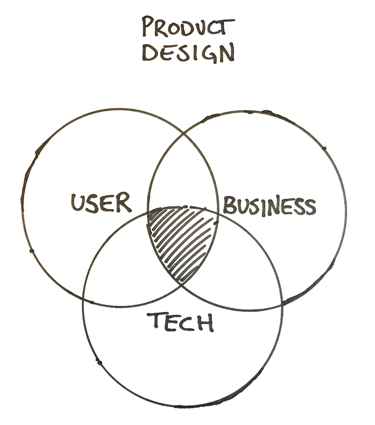
As Head of Product Design at Freespee I have led projects to give Freespee a new visual identity. This included creating Design Principles, setting up UX and Design Component Libraries for all teams and offices to use, and clear Design Guidelines for how things should look and work. In short: a complete Design System. All our Users needed a clearer sender and a tighter visual language, whether they came from the product side or through marketing. Freespee needed Consistency in the UX and Design experience.
Adding Design Values
The project targeting the company Design Values started with me putting together a 2-day workshop in London and invited our CEO and Marketing Manager to kick-start the new design direction. The workshop concluded (among other things) in a collection of Design Values to guide us in a rebranding of our visual profile as well as a design framework for everything. These Design Values served as the foundation for the Design Team to move forward and develop new Design Principles and Guidelines that apply to all of our products and touchpoints.
Why a Design System?
Starting out at Freespee in 2018, I noticed how the lack of a Design System hurt the organization in so many ways. Every day. Things lacked direction, designs were all over the place, usability were low and everything took a very long time to develop. We needed Efficiency and Scalability among our product teams. And we needed Consistency and Quality right through everything we produced and presented.
The solution was a Consistent Design System to serve the entire organization. Everything from presentation templates to design assets to component libraries would now be available in one place to serve everyone. And immediately the efficiency and quality improved greatly.
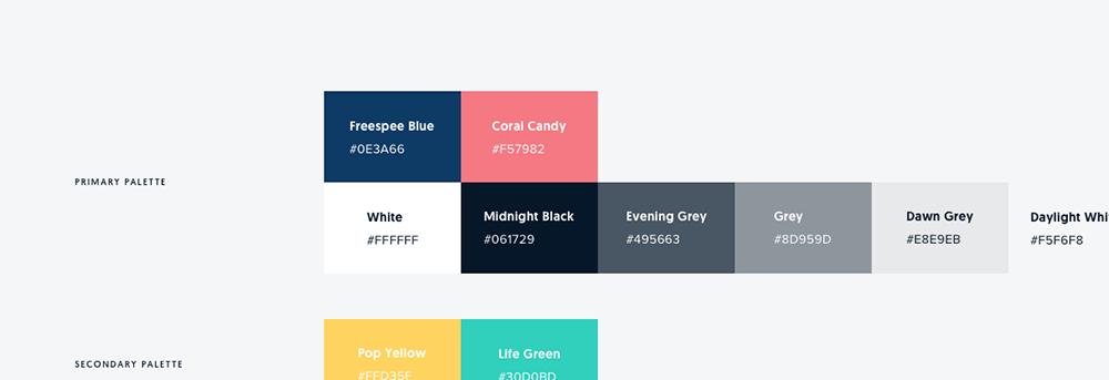
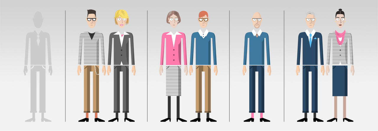
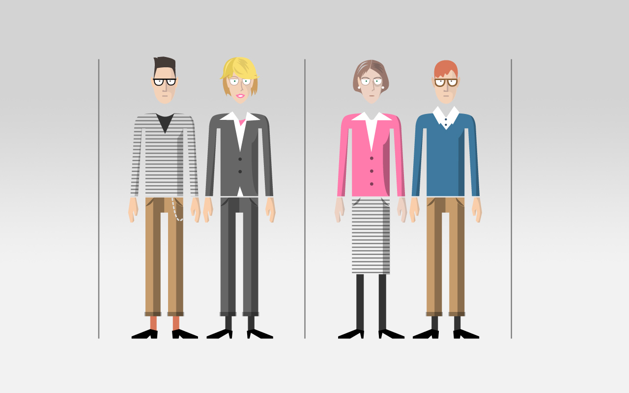
Colors as communication of Brand Values
Our Primary Colors set a clear Brand signature. We performed User Tests, collected feedback, iterated to make sure the colors feel true to the brand and company values and culture. The color scheme shortly grew with a Secondary Palette as well as a Day and Night Theme.
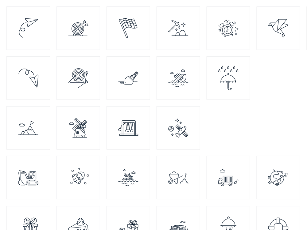
Adding Icon Libraries
We added a couple of Icon Libraries to the Design System together with easy-to-follow guidelines on best usage. These are part of the Design Assets for the entire organsation to pick from when creating a Presentation, E-mail, Sales Pitch or any other Brand or Product Materials.
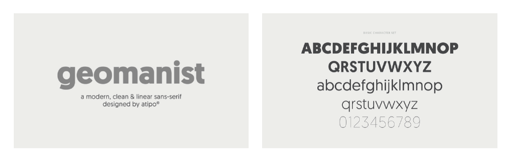
And off course – Fonts!
Our large heading font, Geomanist, reflects the marriage between clever mathematical precision and humanity. It fits very well with our Brand and Design Values. Providing extensive Font Tables to include all fonts used and it’s usage parameters make it easy and efficient for the whole organisation and teams to develop faster and more accurate products and pages.
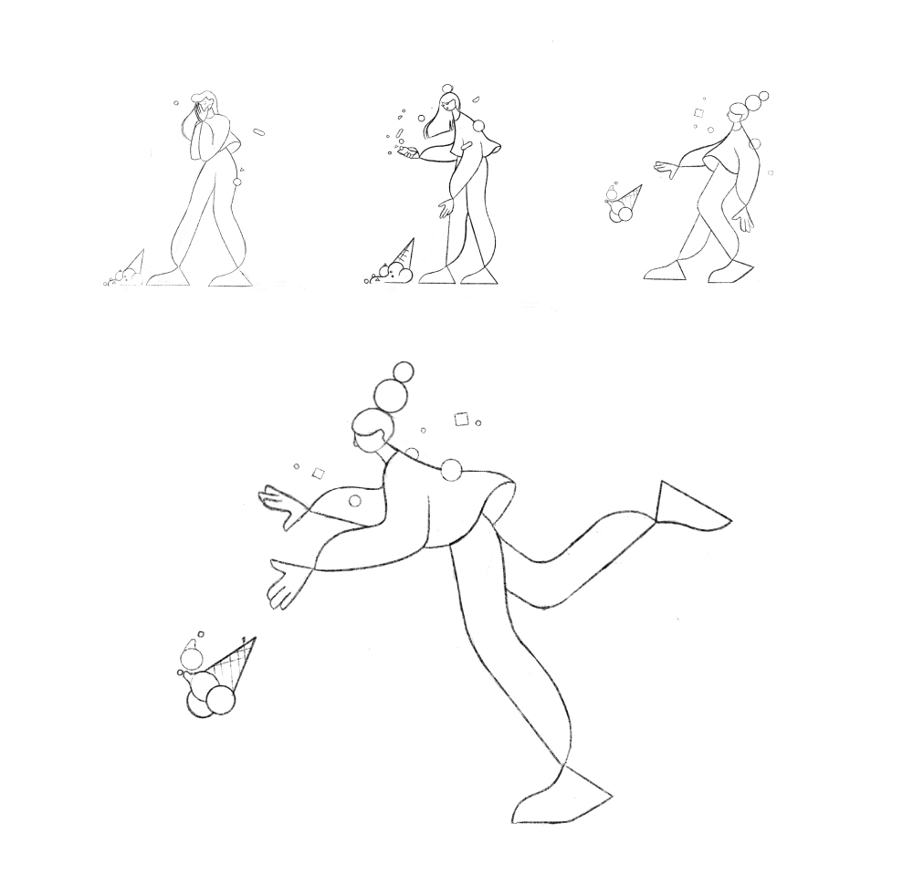
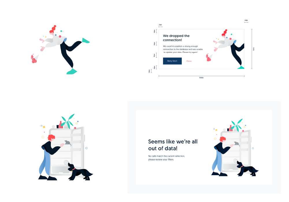
Illustration Library
Having a library of custom made, branded, illustrations make our Designs really stand out. They significantly support our Brand Signature and make it easy for our clients, and future clients, to recognize our Brand and Values. I contacted Freelance illustrator Nata Schepy to help us out here, and we had a great feedback loop going on to pinpoint exactly what every illustration needed to signal to support the idea as well as fit our Brand and Design guidelines.
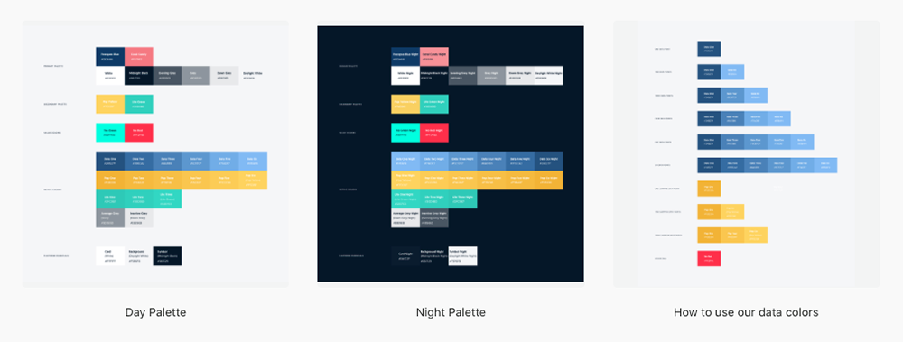
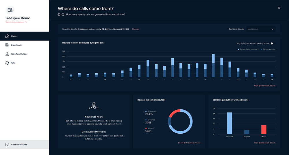
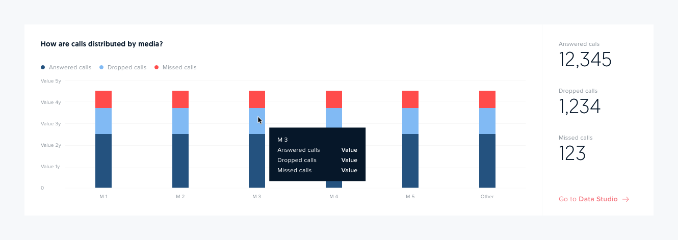
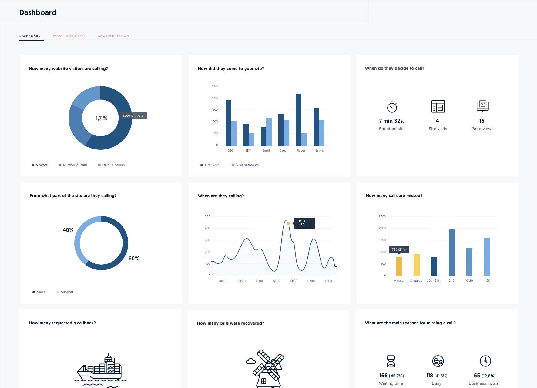
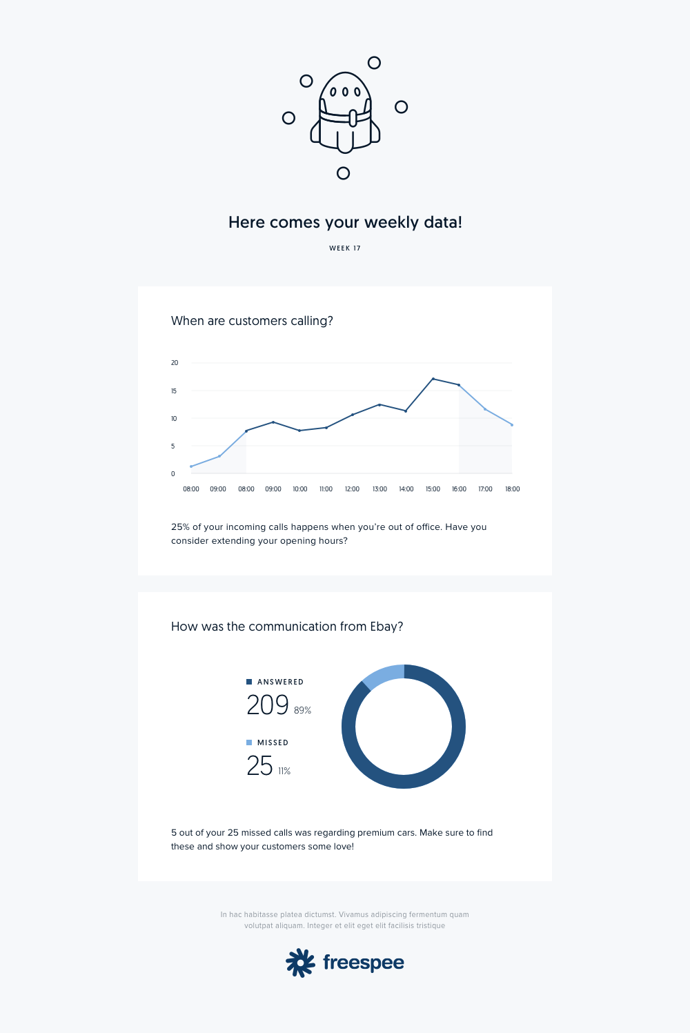
Graphs, graphs, graphs…
A lot of the core business of Freespee is related to presentation of data and metrics. So we added lots of assets, styles and guidelines for different situations and contexts. For instance, some metrics might be used in a surrounding where a Dark theme must be an option. It also depends on what device are being used, at what time, what place, what specific user.
E-mail Templates
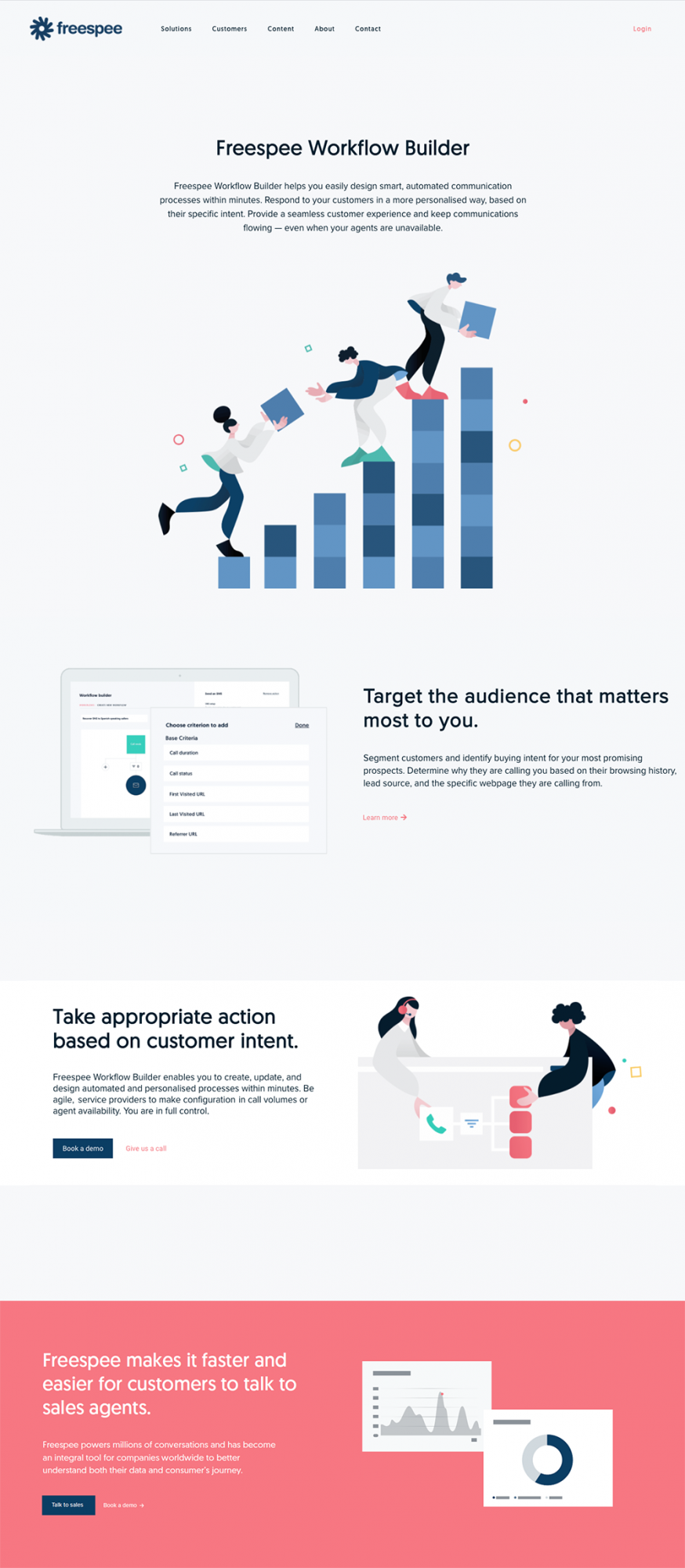
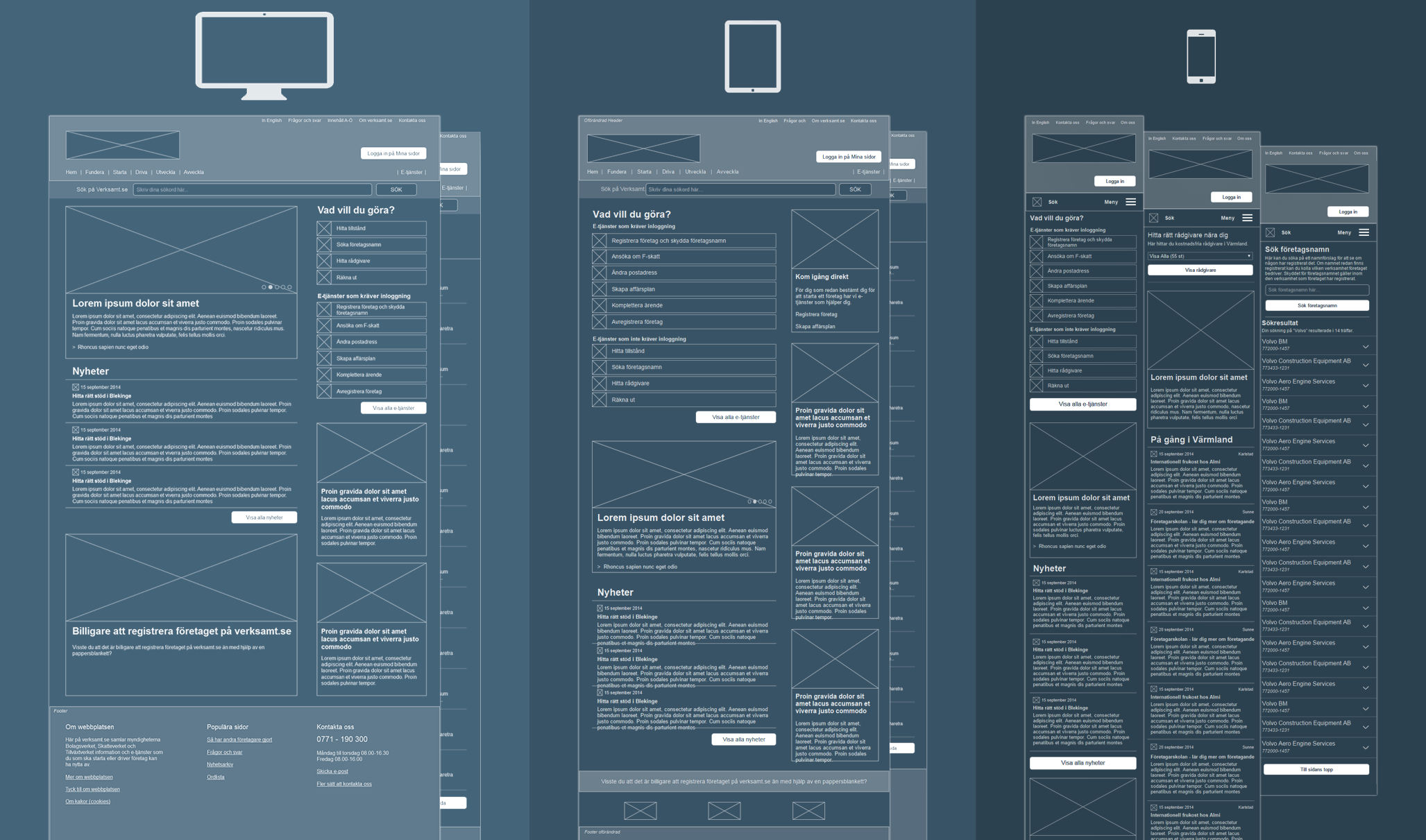
And on the web
Here are a couple of examples on how the Design System works for Responsive Web. When the Design System contains everything from fonts, icons, illustrations, design assets, component libraries and Guidelines on how to best implement, the web designer or content provider can very quickly add content and new pages for web and mobile.
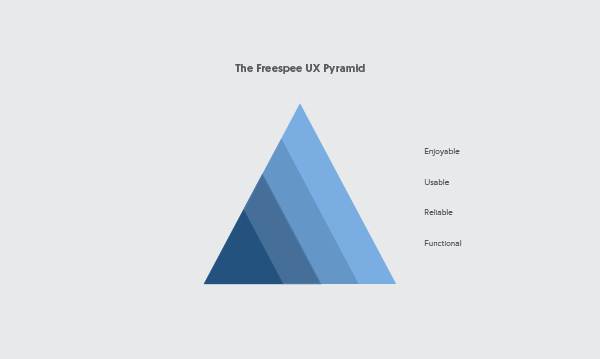
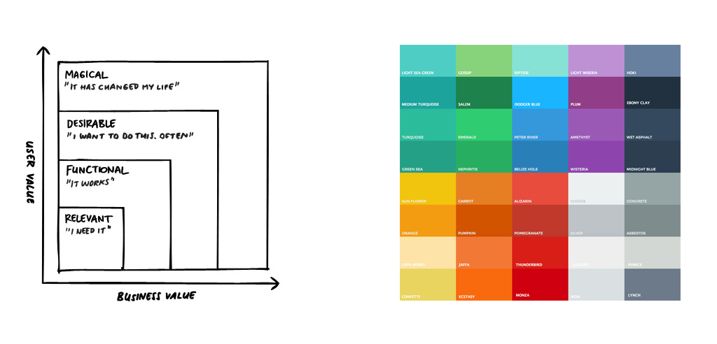
Building a UX Pyramid
I designed this UX Pyramid as a Guideline and Diagnostic tool. All parts of the pyramid must be carefully planned and designed to create an excellent user experience.
The base of the pyramid consists of Functionality and Reliability. No matter what type of product or UI we design, these parts must be tested and deliver at 100%. The next step, Usability, is where skilled UX Designers come in. A first class Usability makes a product easy and intuitive to use. At this stage, User Tests is an important tool in the process.
I have chosen to call the top Pleasurability. This is where we make our products stand out. It is all about attention to detail, creativity and quality that is based on full empathy for our users – but goes beyond what is expected. I encourage team members to explore beyond conventions.
As a UX & Design Manager, I love to inspire and make my UX designers feel creative and brave. It’s when we push the boundaries of what is possible that we create innovation and real magic.
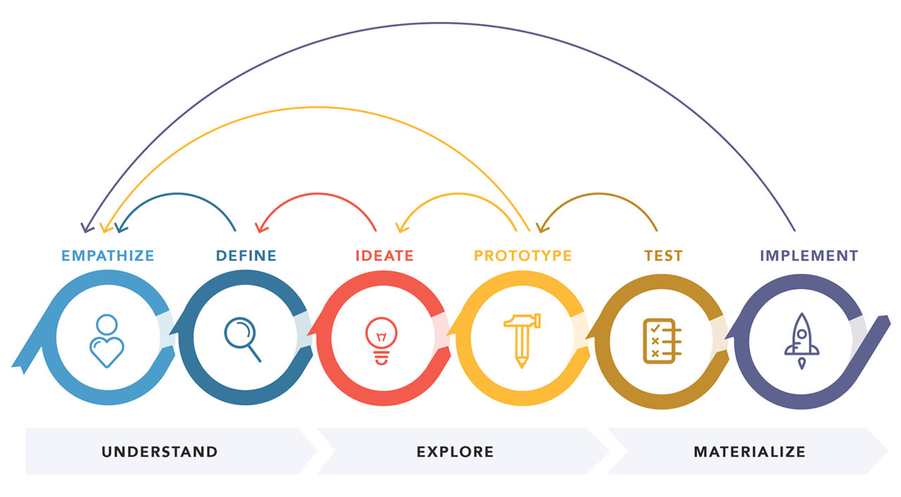
The Basic Design Thinking Process
I always base my teams design process around Design Thinking as it was first defined by Nielsen/Norman. However I sometimes modify it a bit depending on situation. Design Thinking is a great way to put emphasis on the importance of Understanding, Exploration, Testing and Feedback loops.
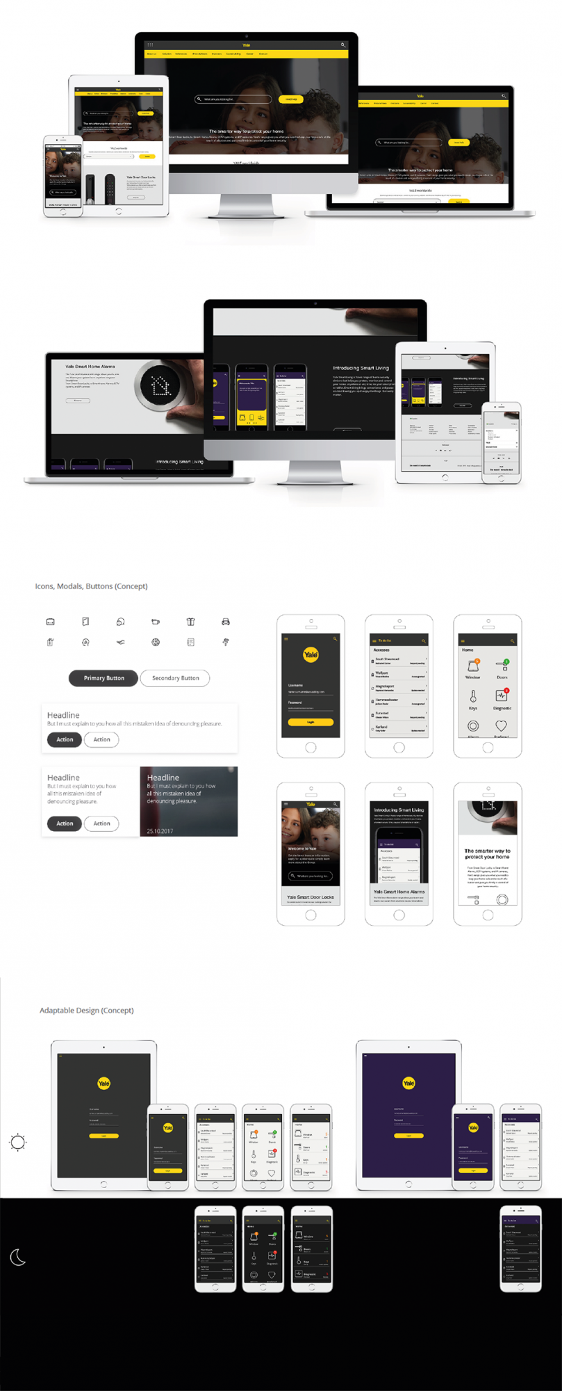
ASSA ABLOY & YALE (2016-2017)
I acted as UX Lead for a redesign of Yale public sites in Europe and South Americas (below). I also helped Assa Abloy improve their online B2B e-shop experience, mainly focusing on Interaction Design, Usability and CX.
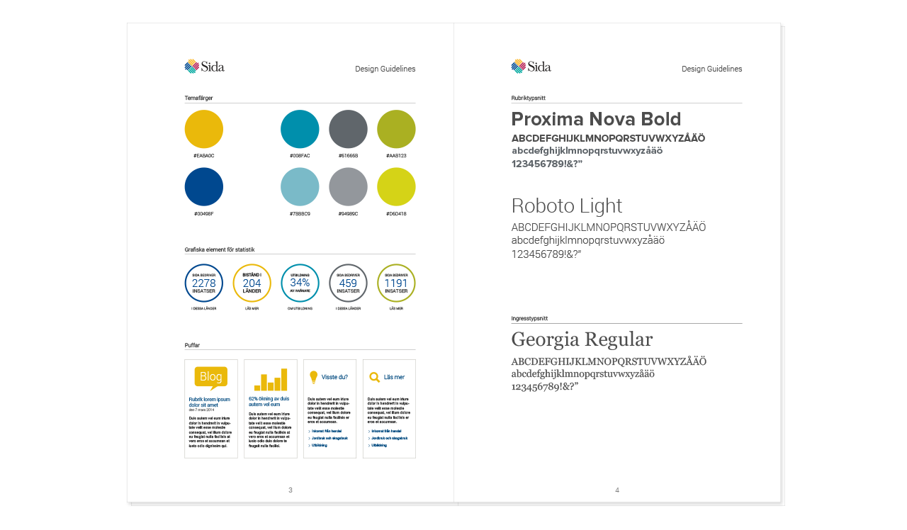
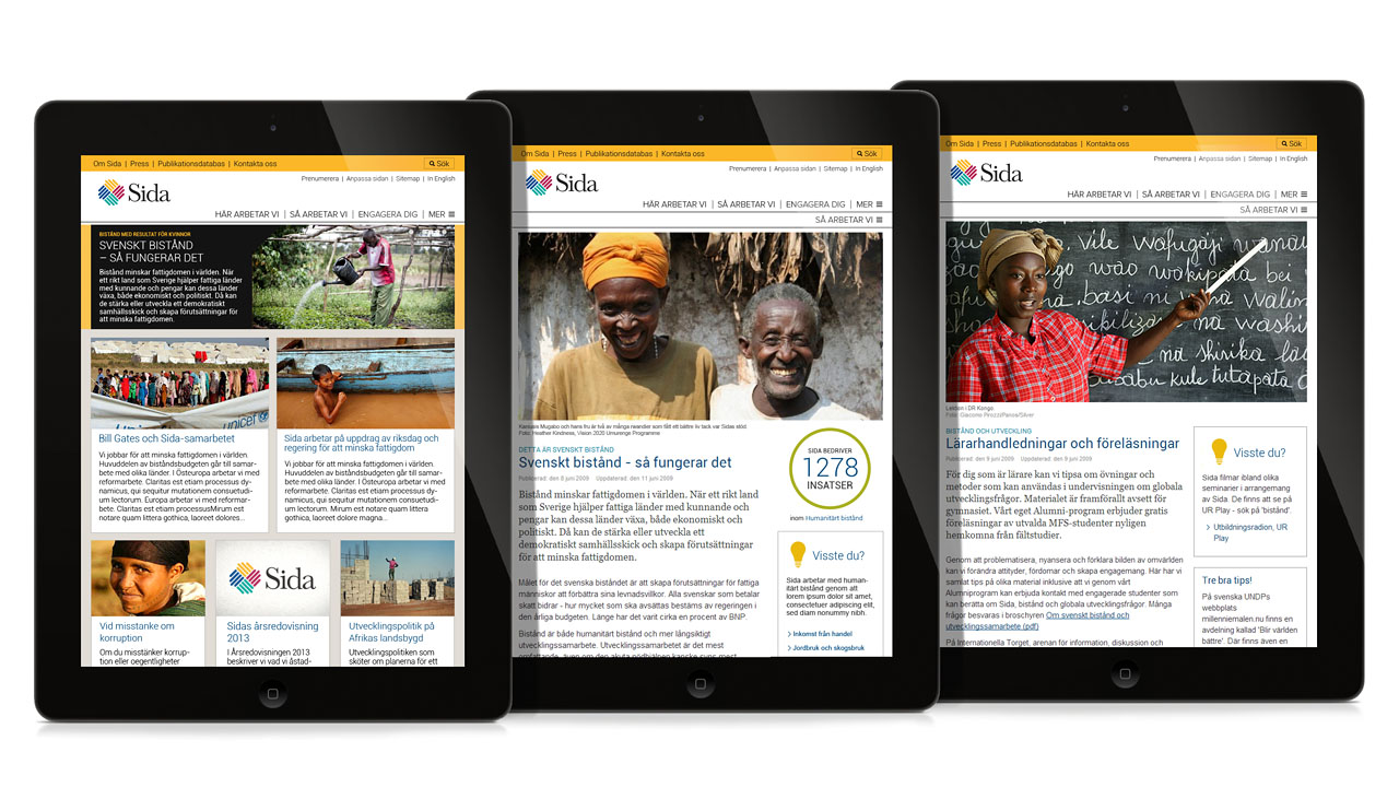
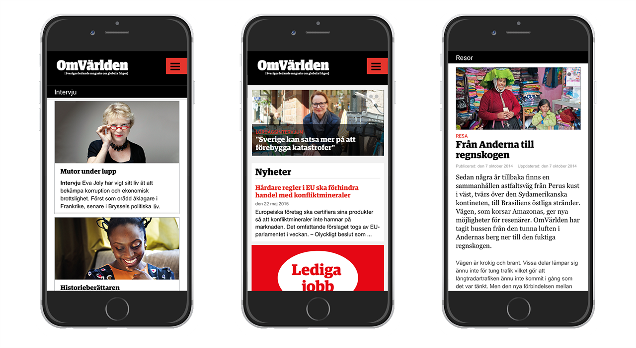
SIDA (2015) UX Design and Visual Design for the organisation public web, and a responsive design solution for the digital magazine OmVarlden.
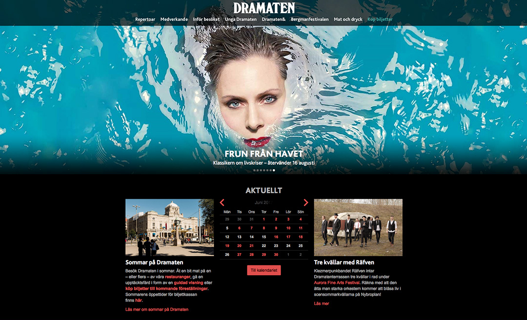
THE ROYAL DRAMATIC THEATRE Art Director (2008-2011) This web redesign was awarded with Svenska Designpriset
Early work
HSB / CYBERCOM Example of some Illustration work (2013)